2020 - 2021
Livestock Design System
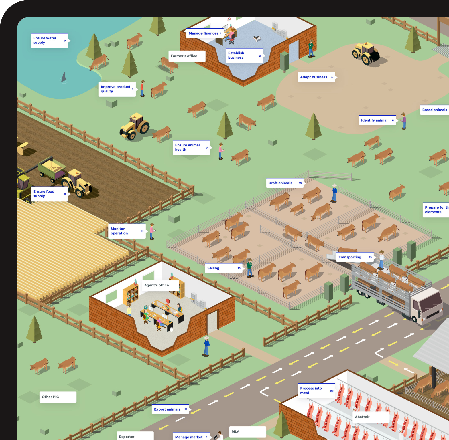
Built a design system and prototyped a future vision of a livestock transport system.
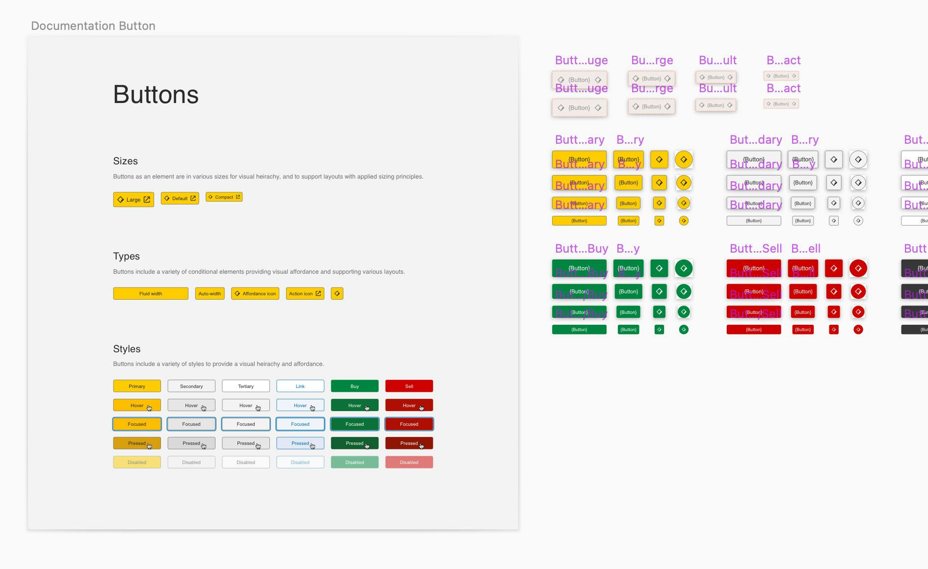
CommSec had a huge inconsistency issue, the styling was jarring, and experiences felt disconnected. An initial UI audit revealed 22 unique buttons throughout the web & mobile experience caused by ancient and multiple coding languages.
You can see why things have become unravelled; there are 17 separate scrum teams, all delivering content at different timelines, as well as third-party scrum teams hired for overflow projects.
Hired through Hello Human, I began as the sole Designer, tasked with kickstarting the design system. As the team grew, my role evolved into a hybrid of product owner and front-end developer (ReactJS & Typescript). Half of my time was as a front-end developer embedded in the design & UX team, and the other half was pushing the design system forward with the now five-person team.
The fundamental principles we developed as a team was to ensure consistency, usability and accessibility. I designed many of the initial components, and then a new designer took over as I transitioned into the product owner role.
We designed the components in Sketch as Figma was still in its infancy and not onboarded through the Commonwealth Bank allowed software.
Commonwealth Bank's new initiative was to be the most accessible bank in Australia, so we used that motivation to spend a great deal of time researching usability & accessibility best practices to embed rules into the components. We decided to follow WCAG 2.1 guidelines as 2.2 can be too strict when keeping a branded feel still.
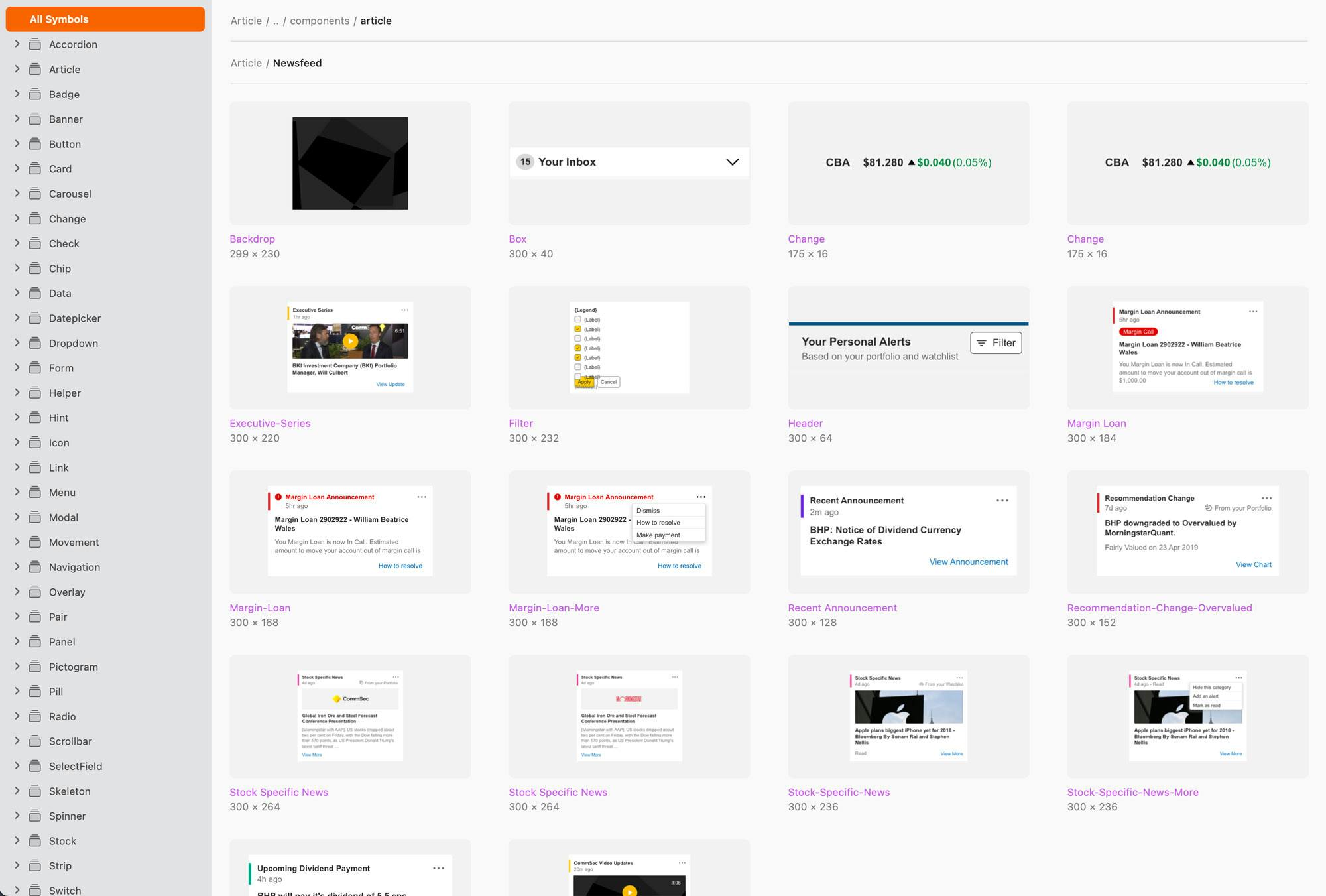
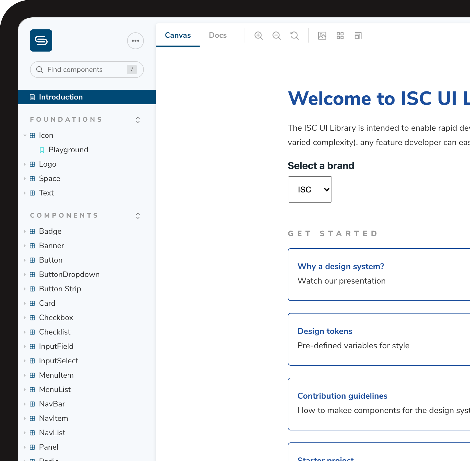
Building high-quality components can often be a lot harder than the design. We faced the issue that the developers assigned to help build our components have never written in React before. To help combat this, I coded a custom design specification platform utilising Gatsby - allowing the business to extensively document each component and bridge the gap between design and development.
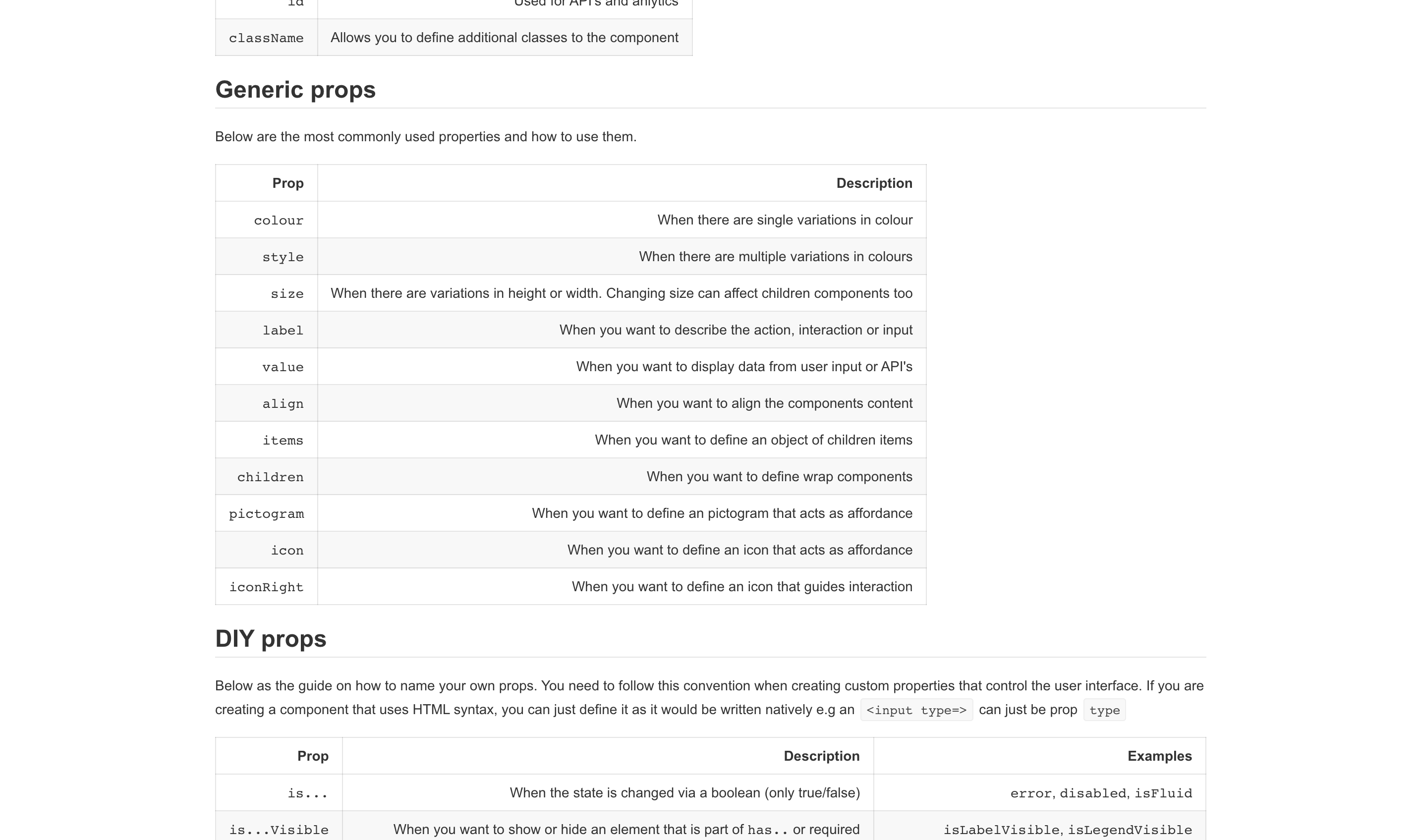
Regarding how the documentation platform would work within our team's workflow: the Designer would show me the component and how it works. I would then translate that into specs and define what props are needed and specific accessibility/usability requirements.
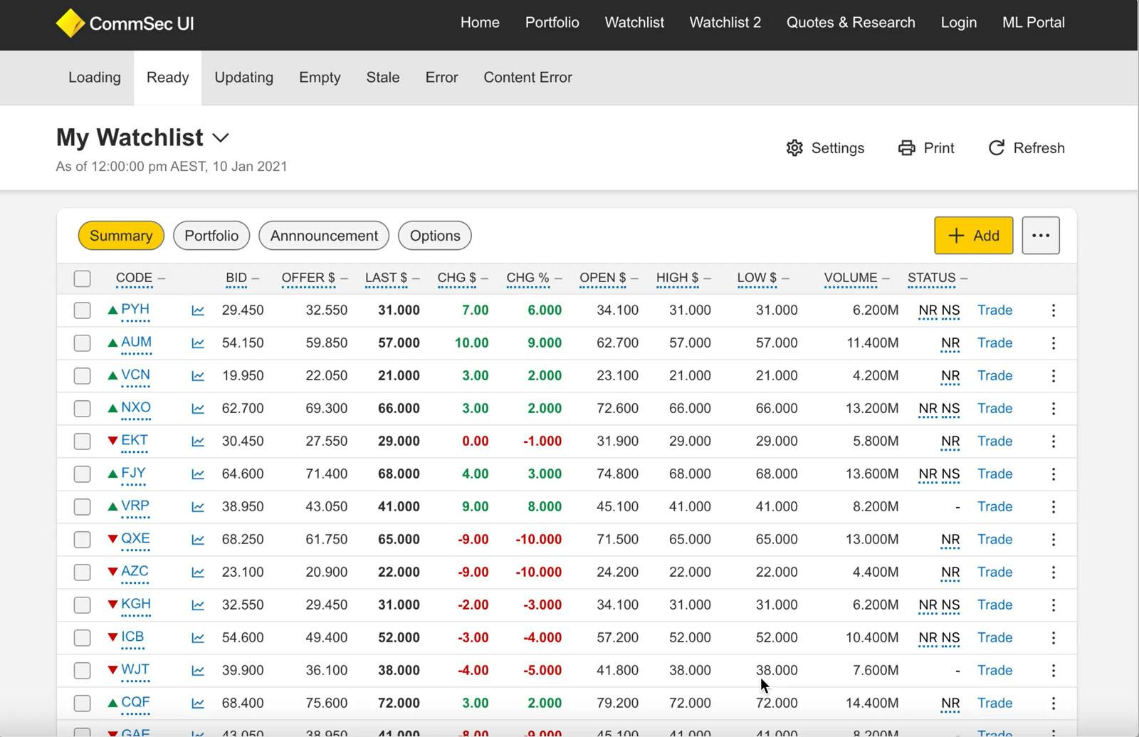
Since CommSec is mainly financial data, it's time-consuming to mock up a page with many stock codes, for example, a Watchlist. As part of a hackathon, I built a stock generator plugin inside Sketch that connected to an internal API and generated a table of chosen stocks.
The plugin would replace any text layers within the schema with real-time values of that chosen stock. This plugin saved teams hours while designing.
CommSec has a native Android & iOS app and a responsive web experience, split into separate scrum teams. We needed a way to version changes throughout each platform simply and centrally.
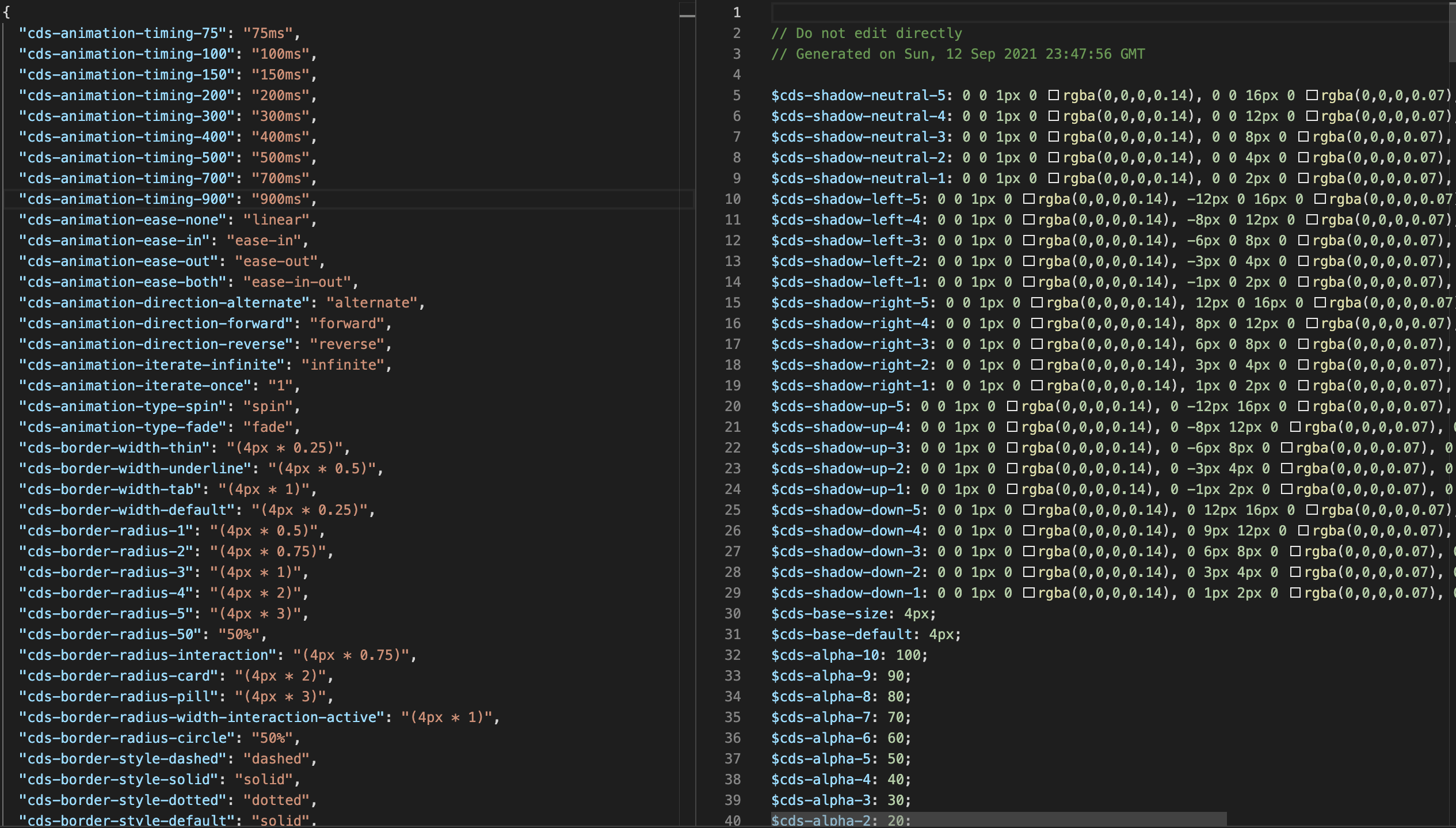
We developed design tokens and managed them with Style Dictionary. Defining variables controlling colour, spacing & sizes in JSON allowed us to export to any desired format native to each platform.
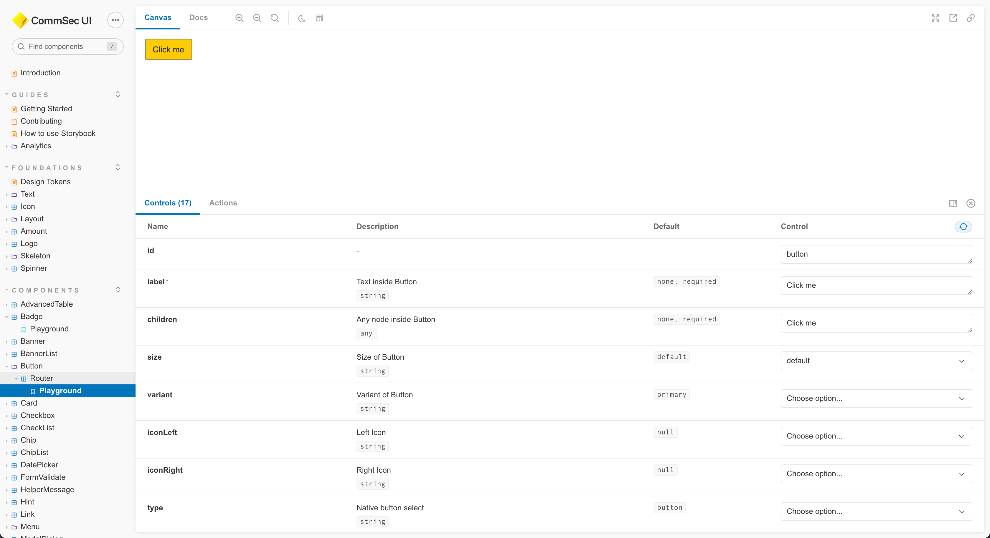
This tool is crucial to visualising a design system, and we did extensive work on it. Props and their options are automatically derived from component typings using Storybook Docs.
Over time, comprehensive documentation was written to onboard scrum teams and existing project developers.
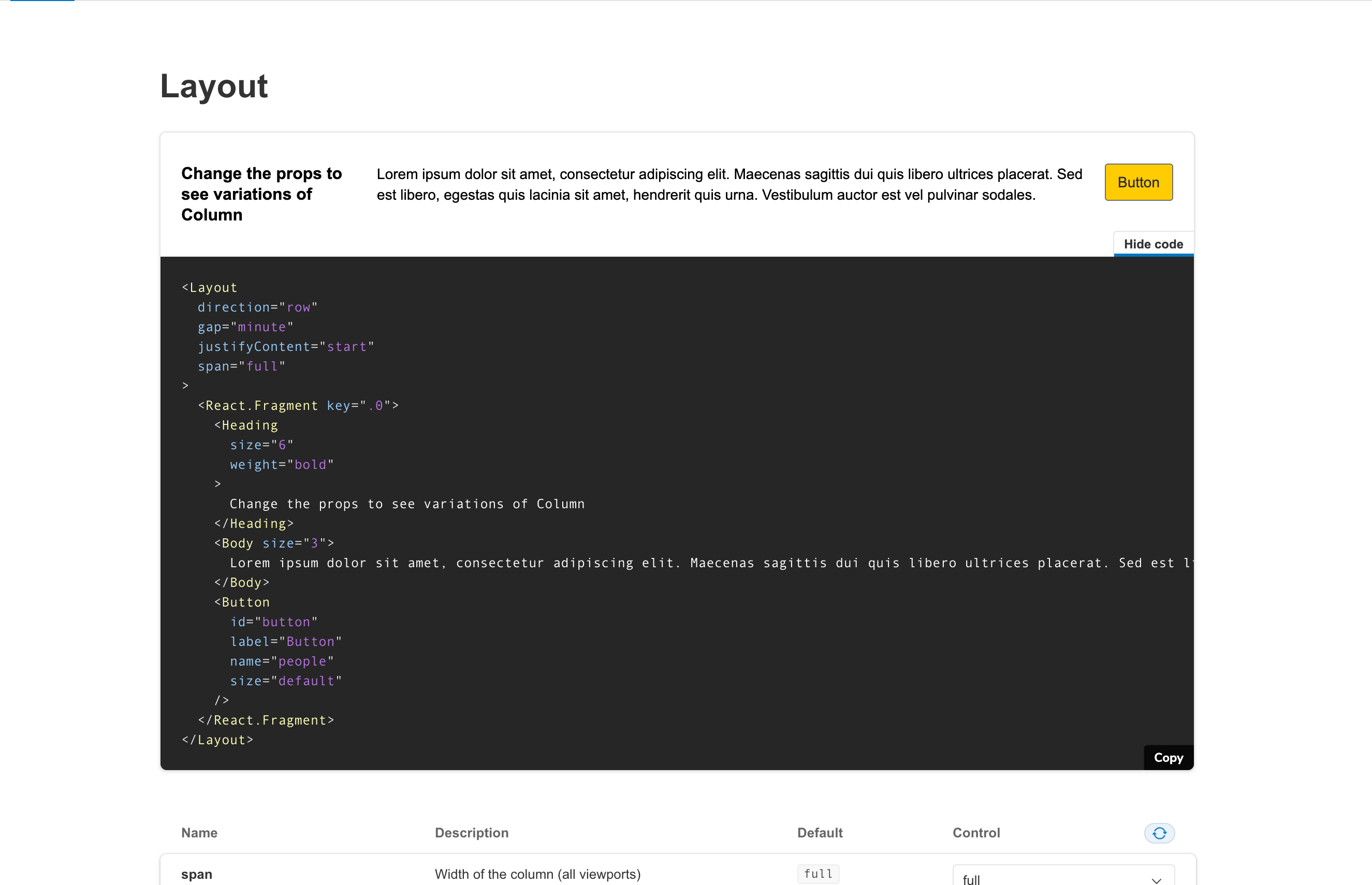
Testing states and patterns can be tricky when only dealing with static images in Sketch. To solve this, I built Sandbox, which consumes the latest design system package in an ultimately 'dumb' environment (without any back-end logic). Having a pure front-end sandbox allowed UX to test experiences before going into production and provided an extra layer of testing for all components.
Sandbox also improved my quality of work as I could now accurately perform gap analyses on components and truly understand what iterations are needed on the components to get from A - B.
Sandbox was a great time/money-saving tool and an essential part of the project → production workflow at CommSec.
We had the chance to onboard a few scrum teams to the design system, which gave incredible insight. We had made mistakes along the way, and they materialised once other scrum teams started using the system. One of the major ones was Typescript. Not all components were Typescript, which made governing prop changes very difficult. When the central team would push a new version of the design system to feature teams that had breaking changes, it was hard to communicate those changes with little effort. We quickly changed our roadmap to convert all our current components to Typescript to ensure the situation didn't escalate further.
When onboarding feature teams to a new project, I acted as a bridge between design and development by providing a Sandbox example of the project to use as a boilerplate - which demonstrated layouts & pattern assemblies. For us, Storybook was the source of truth, and if there were any discrepancies in the designs, then the code would always take precedence.
I would start using Figma to design the components - It's the best tool for creating user interfaces. It's also available on PC!
I'd be more selective with the core design system team. The business gave us whoever was free at the time, and some members weren't that passionate about doing design system work.
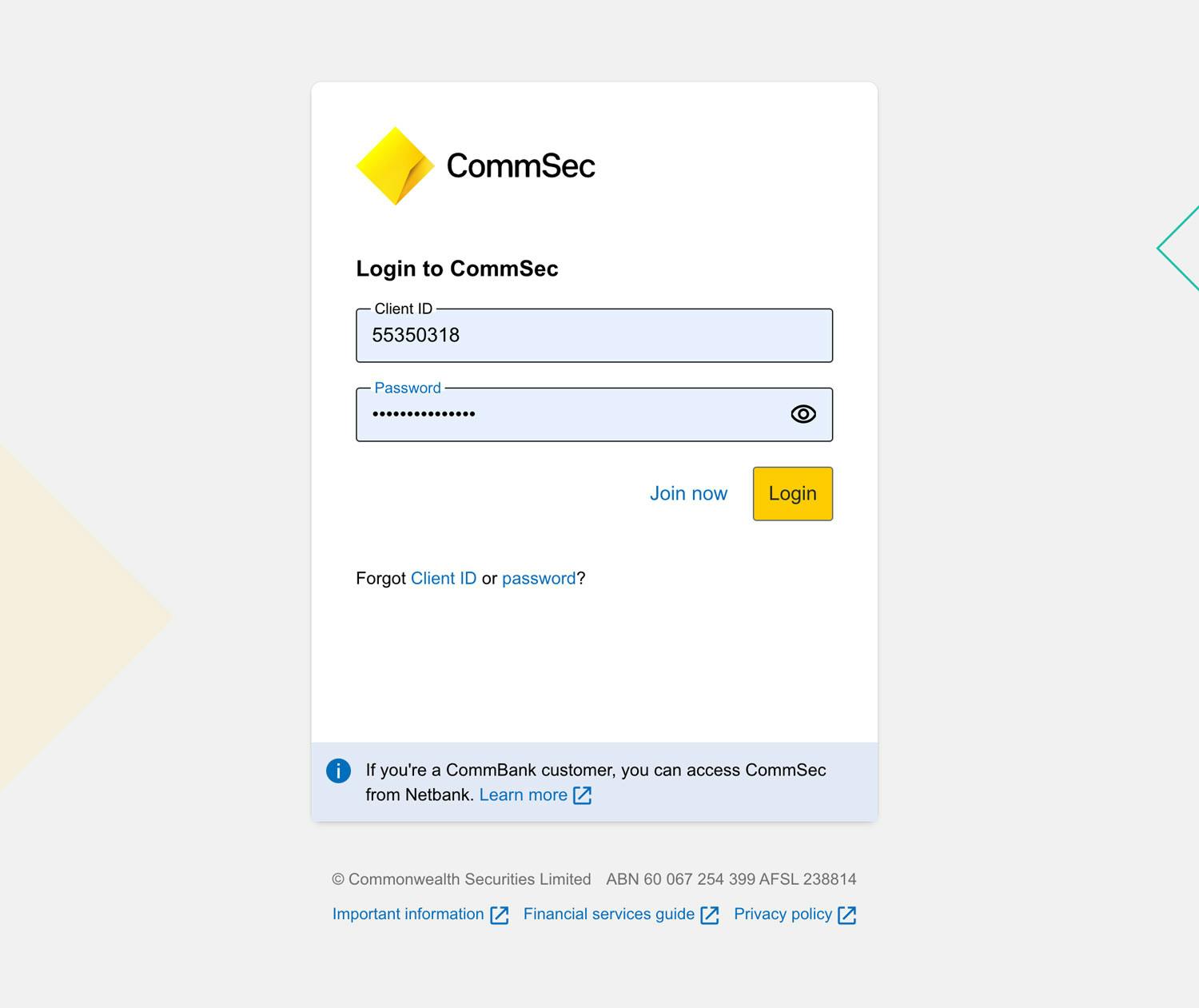
Login was the first live project that used the design system. It was a huge milestone and something I know myself and the team are proud of what we accomplished.
Built a design system and prototyped a future vision of a livestock transport system.
A 3 month project researching the usability of a levy funded livestock transportation system.